 FINALLY!
im able to upload the other two!
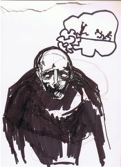
obviously, not as strong as the other two, at least i think so. this profile-type view is ok. im happy with it. but the last one i think i made some bad choices with the face and such.
if i remember correctly my only REAL critique was that i put too much time into the hair. i should try and make it one shape and tone, and limit too much "noise" in the hair? even though i like what i did with the hair, i can understand where that comment was coming from.
also, i should have played up the props more. or so says the instructor. but i understand that also. without those certain story telling elements it's harder to determine who this character is. so...
lesson learned.


No comments:
Post a Comment